


Problem
Solution
Metrics
+12% subscription CTR
Team
Product, Growth
and Engineering
01. Shaping the experience

02. Opportunity
As subscription models became standard in online learning, user expectations shifted toward continuous access and clearer learning paths.
The opportunity for Domestika was not just to add a subscription, but to support learning as an ongoing journey. Research indicated that many users were unsure what to learn next or how courses connected over time, creating a gap where a subscription could provide structure and progression.
The design challenge was to translate this into an experience that felt intuitive and on brand. PLUS needed to appear at the right moments, reinforce its value through use, and complement existing purchase flows rather than replace them, positioning it as a natural part of the Domestika experience.
03. Design solutions
The goal was to make PLUS feel like a natural extension of Domestika, both in product experience and brand expression, while clearly differentiating it as a premium offering.
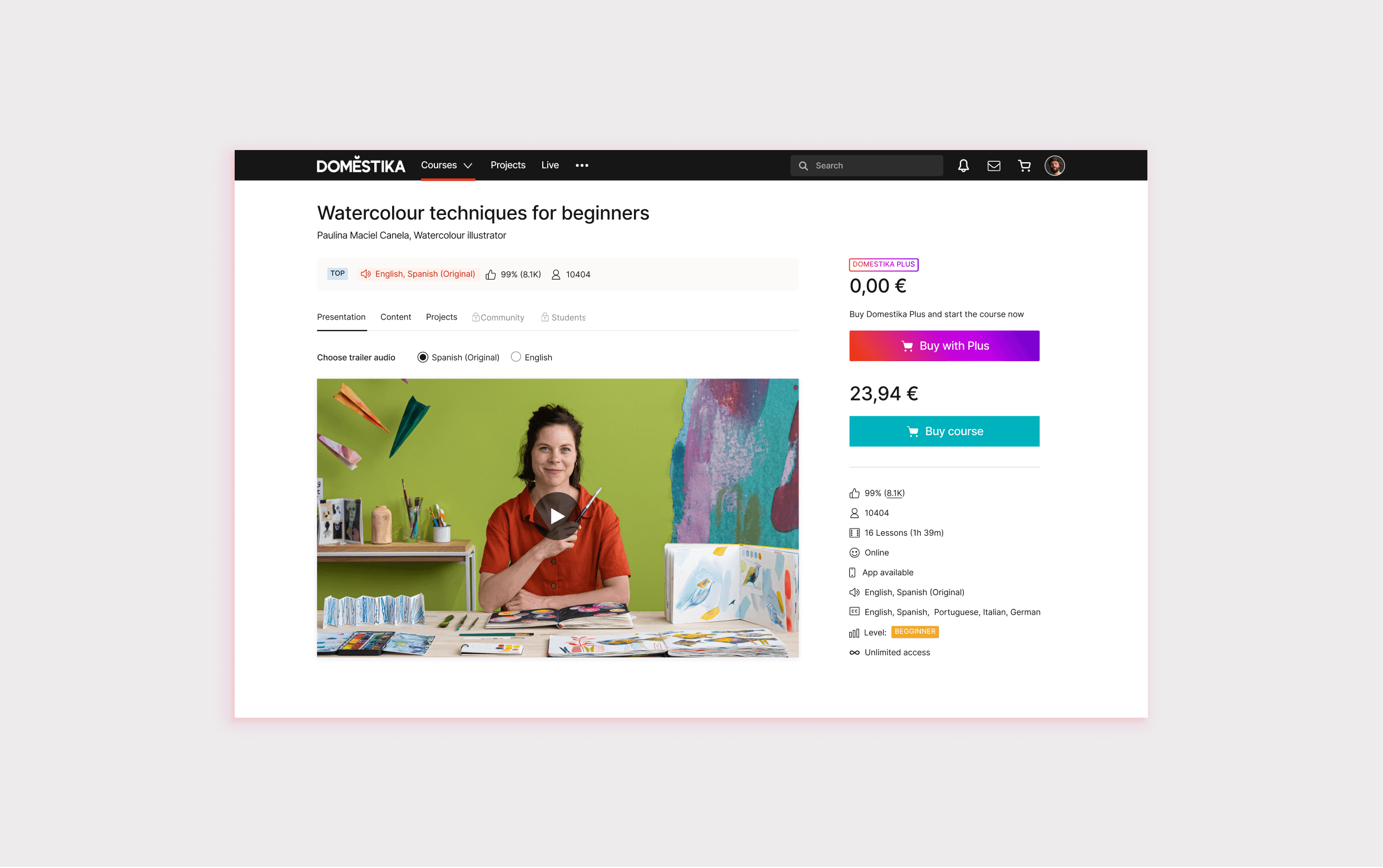
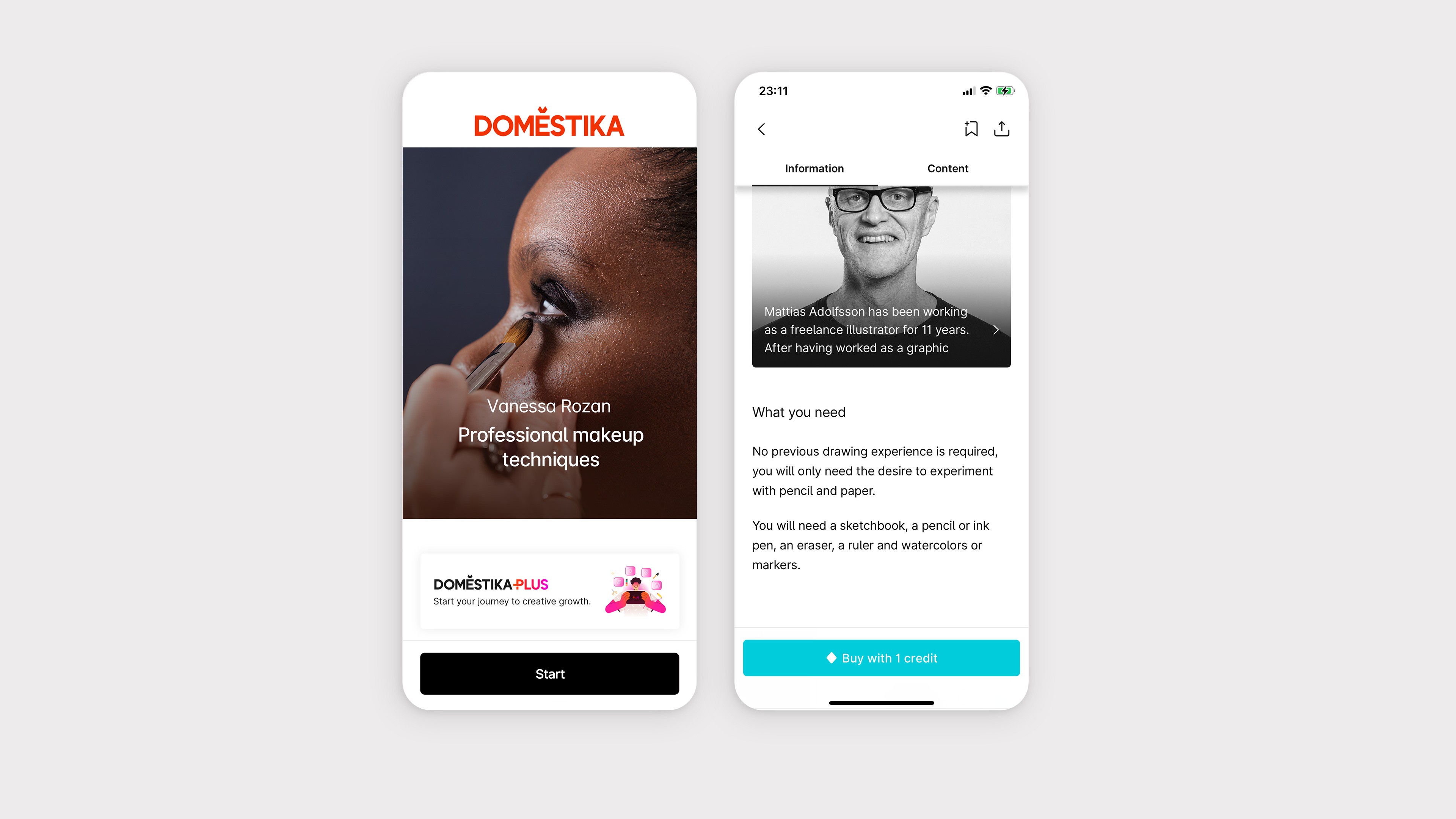
I defined a design approach focused on integration rather than disruption. Instead of introducing a separate subscription surface, PLUS was embedded into existing touchpoints such as course cards, user profiles, and checkout. This allowed users to understand subscription value within familiar contexts, reducing friction and decision uncertainty.
To support this, I worked on new interface components and content blocks aligned with Domestika’s visual system, extending the design language without breaking consistency. Entry points across navigation, landing pages, and promotional surfaces were designed to reinforce value progressively instead of relying on a single conversion moment.
The guiding principle throughout was clarity and restraint. PLUS needed to be visible and desirable, while remaining secondary to the learning experience itself.


04. Results
The first iteration of Domestika PLUS showed clear traction across acquisition, conversion, and engagement.
The new landing page attracted more than 17,000 unique users, and checkout completion increased in flows where PLUS was integrated into course cards and the purchase journey. Early performance reached a low single-digit subscription conversion rate, in line with expectations for a new model, with retention remaining strong after the first billing cycle.
A/B tests confirmed higher click-through and completion rates when subscription value was clearly communicated. User surveys reflected this impact, with an 8% increase in overall satisfaction. These results validated the approach and enabled the expansion of PLUS from web to iOS and Android.